$0.00

With the rise of the digital age, traditional forms of marketing have fallen out of the limelight. But research shows that an appropriate business sign can drive attention to your brand, increase recognition, and drive sales. In fact, a study conducted by FedEx revealed that over half of small-business owners find in-store signage and graphics effective in attracting customers. A separate study found that nearly 76% of consumers said they had entered a store or business they had never visited before based simply on its signs. So how can you make the most of your signage and move your bottom line? Keep reading for 5 design tips you should implement to attract customers.
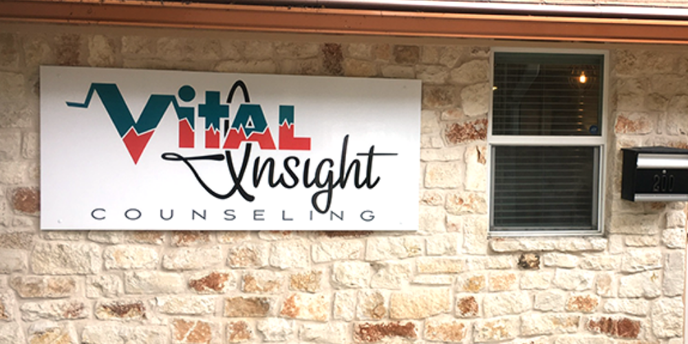
Color
Color choice should play a big role in your business sign design. You want your sign to be seen, remembered, and recognized were they to see it again. Choose something that pops and catches the eye. At the same time however, your signs shouldn’t conflict with your established brand – when someone looks at your sign and then walks into your store, they shouldn’t doubt where they are.
For signs that you intend to use for years to come, avoid using “trendy” colors. Today’s trend can become tomorrow’s eyesore! Choose colors that will serve your business for a long time. Signs can be quite durable, they’ll last decades if properly taken care of.
Contrast
The overall color scheme is important, but also remember to keep the sign legible. Your lettering’s color should contrast with the background enough to be easily read. You only have a couple seconds of someone’s attention and they have to be able to read and understand your message. Dark designs on light backgrounds or the inverse. If similar colors have to be used, consider an outline or a shadow to help the front design and letters stand out.
Size
Depending on the placement of the sign, you’ll want to think about how big the font or design should be. A good rule of thumb is 10 feet per inch of letter height. For example, a sign with 8 inch letters will have the best impact 80 feet away.
The font itself also plays a role – cursive fonts will be harder to read at a distance. You might have to increase the size of the font in order for it to read well. If your design includes cursive font, you could benefit from a consultation with us to determine the correct size and format of your signs. Request a free consultation here.
Quantity of Business Signs
Don’t just rely on a front of store sign to attract traffic. In their study, FedEx determined that on average, consumers think a small business should have two or three signs around its storefront. Consider adding directional signs around your location to help people find your business easier or in store displays to guide customers to your sales and special offers.
Quality of Business Signs
Last but not at all least, your signs should reflect the quality of the goods it sells. A professionally designed and crafted business sign will help you tell your audience that you provide high-quality goods and services. Ditch the handwritten signs and opt for printed or even painted materials. We offer many different types of signs and promotional items, and would love to help you with your next project. Click here to get started.
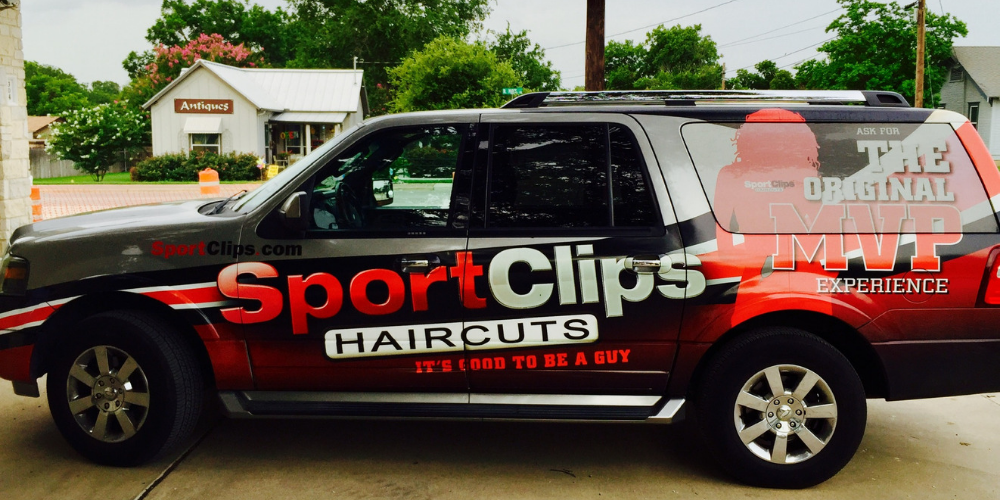
Implementing these 5 tips will help you get the most of your signs for years to come. At Larry Perez Signs & Graphix, we specialize in making unique business signs that represent your brand well and help you stand out in a crowd. We can also help you wrap your company vehicles to extend reach in your service area and drive people into your store to see your amazing new signs. We will work with you to develop a customized solution for your needs. Schedule a consultation to tell us more about your project and get started.